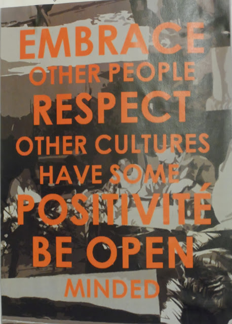
We had to create our own manifesto that highlighted anything from our experiences, our future, our past or what we believe in. I found this to be initially a very broad and vague starting point and I struggled for ideas early on so I began to jot down everything about me. I included my cultural background, my values and what I believe in which helped me start the development. languages and sense of place is something important to me so I have the intention of including some sort of photographic element in my manifesto and also some alternative languages that are significant to me in some way.
I collected some of my own photography captured by myself or my family and created a photo montage, I then scanned this onto illustrator and then played around with the filters, saturation, contrast level etc. My first designs incorporated a striking orange font, I thought this was really powerful and stood out from my background images very well. I stuck with this and used bold orange font on a gray scale backdrop of photos to make up my manifesto. I also included another language in the word 'positivite' which I chose because its obviously french for positivity therefore this meaning wouldn't get lost in translation whilst still having a personal french connection for me.
Overall, I am very pleased with my final outcome, considering I had no idea what a manifesto was and how to go about creating one. It was initially a painstaking process due to the many directions in which I could take, I had a few conflicting concepts which made progress slow, however I quickly found a direction. I am also satisfied that the manifesto connects to myself and has a meaning for me as well as others, I feel the manifesto is a reflection of myself but it is subtle in a sense that others cannot instantly see what is revealed.
 |
| Some initial brainstorming of ideas and pathways to go down |
 |
| Another brainstorm of my ideals, beliefs and queries on the world and myself. |
 |
| I also explored my future aspirations, targets and goals. |
 |
| Some development of a final idea, here is where I used colour to see what could work and what stands out |
 |
| Development of a final idea, experimenting with font sizes and weights, bold or regular etc. |
 |
| Playing around with the appearance of the photo montage background. |
 |
| Final completed manifesto, inspired by all of the previous sketches and ideas above |
 |
| A close up of the text and some of the background photography |
Images - Author's Own 08/11/13
No comments:
Post a Comment