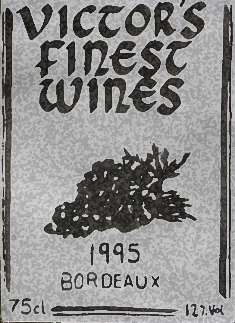
After creating my final wine label, I decided to edit it further and see what else I could do to change its appearance whilst still making it universal. I tried using different filters, changing the contrast, brightness and saturation. Eventually I believe I came up with some good results and I particularly like how they all are subtly different but all are recognisable. The sepia toned label appears traditional and retro, the black label with white outlines I feel is very understated but still has an impact while the textured labels appear weathered and used which gives them an authentic wine label appearance. In conclusion, I am pleased with my results from this workshop day, I enjoyed practicing with ink and understanding the calligraphic style. Due to this, I feel I have been able to create a good final product.


No comments:
Post a Comment