Thursday 31 October 2013

GRAPHICS PATHWAY - PROJECT 2: DEVELOPMENT

On the second day of the project, we began to refine and develop our original ideas even more to the point where we could begin constructing a storyboard highlighting what we were going to film and how it will pan out in terms of the scene and the setting. This process I found took much deliberation and was a time consuming process due to the wealth of ideas and suggestions we all had to put forward.

After some research online on basic film making and themes related to 'juxtaposition' we decided to carry a split screen theme throughout the film which separated the two sides of the story. The three key themes are going to be young/old men/women and courage/fear. These obviously are a contrast and we felt the split screen could clearly convey this message. We also decided that in between scenes we would have quick flashes of the word 'juxtaposition' to subtly remind the audience of the subject matter.

To realise this, we decided to use Ravensbourne as a setting for our sketches in particular the elevator. The story will begin with the young and old comparison in an elevator where the more mature person wears their trousers high up and the young person wears their trousers well below their waste to symbolise the physical and literal generation gap. From the elevator, a man and a women will have a conversation where they don't say necessarily what they think or what they mean using speech bubbles. Then in the final scene a courageous mouse will chase and scare a fearful lion into the end credits and definition of the word juxtaposition. This is a vague idea of how the filming will take place.


Our groups initial storyboard design, illustrating the different
contrasts frame by frame.

Images - Author's Own 30/10/13

Tuesday 29 October 2013

GRAPHICS PATHWAY - PROJECT 1: SELF DIRECTED TASK

The first project assigned to us in the graphics pathway was a good one in my view because it was open and we had a lot of freedom to create whatever we wanted and go down whatever route we wanted in terms of materials and techniques. I followed the musical path as I have always loved looking at album/record cover art therefore I decided to create my own album art.

I decided to incorporate both hand-made and digital elements in my poster image. I first created a background using torn newspaper, glue and some paint applied roughly, to give an abstract appearance. I then scanned this into illustrator and experimented with the filters adjusting colour saturation, brightness and contrast levels. This greatly changed the appearance of my image, although I often changed my mind about how I wanted it to look but after fine tuning the different filter levels, I found the right balance in my view. 


The original colour background created using acrylics on a newspaper base.
Compared to the following image the original looks a bit dull and lacks bold colour,
therefore I think adjusting the saturation really emphasised the texture and
importantly the colour a lot more.

The digital element of this poster was the type, I used illustrator to incorporate the text and again often found myself playing with the size, weight and shape of the type. I wanted a modern and sleek looking typeface to use, I looked at Arial and Imapct which worked well but I stumbled across Letter Gothic Std which instantly stood out in my opinion. Its minimalist, sans-serif style fit the cover perfectly. After making the text bold and italic, I was pleased with its overall appearance however, some of the text is slightly unclear maybe due to the font colour I selected.

The final album cover art incorporating the hand-made background and the digital type.

Images - Author's Own 18/10/13 

GRAPHICS PATHWAY - PROJECT 2: WHAT DOES THE GROUP SAY? GRAPHIC FILM

On the first day of the graphic pathway, we were tasked with creating a graphic film on a random word chosen at from an envelope. We had to create a 1-2 minute film about this word focusing on the layout and the typographic elements of the film in some way. We before hand watched a short film about the typeface 'Helvetica' which gave us all some food for thought about the use of font in today's world. With this, we were separated into groups of 6 or 5 to create the film, my group had the word 'juxtaposition'. We began researching definitions, brainstorming possible themes and working out a story line. The first A1 sheet shows our thought processes and initial ideas while the second sheet shows some more refinement of a single idea. Over the week we will continue to experiment with ideas and develop our idea further, eventually we will begin filming and producing it.

This sheet shows our thought process from one idea to the next. Initially, we looked at the definition of juxtaposition and then branched out from there looking at the word contrast which has a similar meaning.  We explored use of font, split-screens and use of sound to convey the two sides of the story.

This second sheet shows more refinement of a single idea, we decided to look atthe differences between young and old in terms of our everyday lives, for instance in technology, fashion and so on. We focused on on contrasting the old with the new and thought of possibly having a double juxtaposition where the old person adopts a more modern way of life while the younger person adopts a more traditional or old fashioned one.


Imagery - Author's Own 28/10/13

Monday 14 October 2013

EVALUATION OF THE EXPLORATORY STAGE

Overall, the Exploratory stage of the foundation course has been an eye-opener and enlightened me on several different areas of art & design. I had some common prejudices before starting this stage for instance the fact that I wouldn't enjoy fashion at all or be hopeless at 3D work. These I discovered were wrong as I ended up enjoying the fashion rotation creating my own garments and the 3D rotation made me think about my contribution in a team as a team member which was previously lacking from my characteristics. 

The fashion rotation really challenged me to think differently about design and previously I would have struggled with this however now, I can appreciate fashion a lot more due to the fact I made my own garment and realise the hard work and effort that goes into designing and making garments. I was very pleased with my cardboard headpiece in the end. 

The 3DD rotation was probably mentally the hardest week for me because I struggle to think in 3 dimensional terms and I have never been strong with sculpture or anything 3D based. For this reason it took a while for me to fully embrace the briefs and I started off slowly at the beginning of the week however with time, I immersed myself more and more in the 3DD week. Making spaghetti structures was at times frustrating but ultimately rewarding as it required patience and a delicate hand. I particularly enjoyed building the model bridges out of cardboard and bamboo, I learned to listen to others in our group and appreciate the teamwork aspect of it. Seeing the bridge support its own weight and then watch a remote controlled car go over it was the highlight of the rotation.

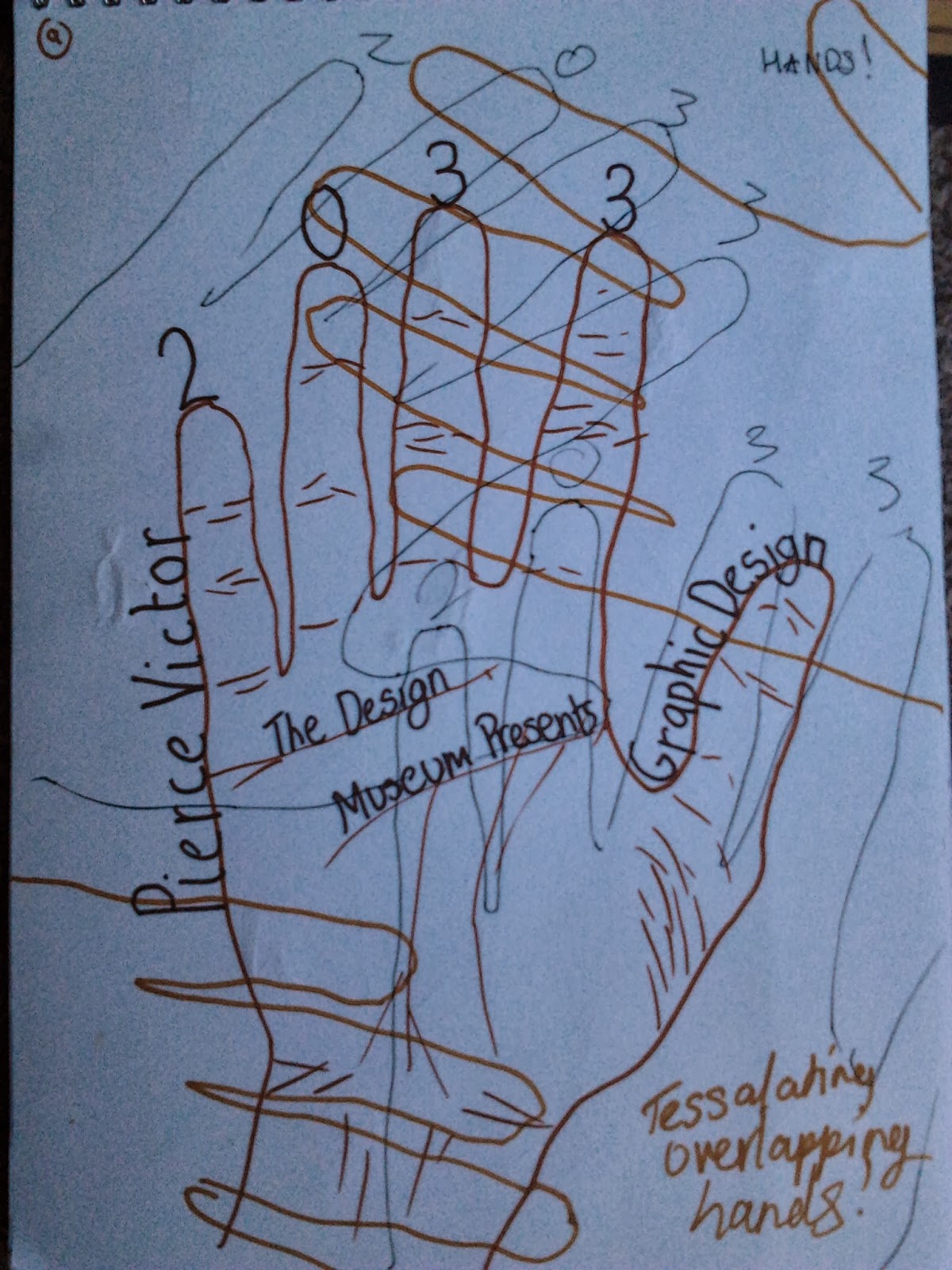
My preferred discipline, graphic design, was what I expected it to be and more. Focusing on words and faces effectively made us experiment and reconsider different aspects of our work before beginning our final piece. Making a poster about myself in the future was a challenging concept but I was quite pleased with my final outcome. Input from my peers was helpful and the end of the week display made me feel like I had truly created something aesthetically pleasing. 

The lens based media rotation was educating, I now have a greater appreciation for filming and the artistic value behind film making which I was previously unaware of. Often we watch films and don't consider the work or the thought process behind it, the lens based week has allowed me look at film making differently from now on. The photography aspect was interesting specifically when we had to sum up a word such as 'happy' or 'sad' in a photo. In summary, the exploratory stage has given me food for thought and informed me more of the art & design spectrum as well as confirming my decision to pick the graphic design pathway.

The initial design process behind making
my headpiece during the fashion rotation.
My final headpiece creating using only cardboard

The bridge our group created during the 3DD rotation using only bamboo,
cardboard and some tape. I really enjoyed this activity because of the
teamwork involved and the evolution of ideas that took place
throughout the process.
My alphabet created during the 'words' phase of the graphic rotation.
This was a total experiment and the letter forms had no real direction,
I was purely trying something new and different to what fonts we
already have

My final future A2 exhibition poster created on the final day of the
graphics rotation. This is one of my favorite outcomes of the
Exploratory Stage.

An image I captured specifically for the lens based media rotation week, based on narratives and creating our own story lines

An A1 drawing I completed on the first day of the lens based media rotation, we had only an hour to complete this therefore it was a bit rushed however I am still pleased with the outcome. This drawing consisted of a number of different elements taken from my photos. I combined a bus stop pole, my view from the upper deck of a bus and my headphones on top of a laptop.
Images - Author's Own

LENS BASED MEDIA ROTATION - FINAL STORYBOARD

My final storyboard  was slightly different to my original idea, and throughout the day the narrative underwent many changes and tweaks. My original story was good but it could have been improved, for example including a greater struggle, more drama and suspense, so throughout the day I tried new ideas, rearranged the order of the images and also borrowed some ideas and images from my peers. This I found worked really well because we exchanged ideas about each others stories giving each other a different perspective which was really valuable in the end. In addition, exchanging photos also helped developed my storyboard as I wasn't limited to my own photography. I found this task challenging because I underestimated the skill it takes to craft a compelling narrative, I thought it would be easier but in reality it's difficult to balance different elements of a story in only 6 images. I was also very impressed by the standard of my classmates's stories as some were comical, dramatic and fun.


My first storyboard idea in my sketchbook, this was the original
story I wanted to use but I ended up changing it slightly
My second storyboard design incorporating an image from one
of my peers.

My final storyboard of six images on an A1 sheet.


Images - Author's Own 10/10/13

Friday 11 October 2013

LENS BASED MEDIA ROTATION - NARRATIVE IDEAS AND STORYBOARDS

The full A1 sheet of drawings 

On this second day of the rotation, we were asked to make collective effort in groups as we all made our own contributions onto one single sheet of A1 paper. We all drew certain things from our memory onto sections of the paper recalling our own dreams, nightmares, fears, passions, favourite places and ideas of hell. We did this in order to create a story and identify possible characters to use. Below, are my drawings in black pen of various people and places that mean something to me or hold a particular significance in my memory. I found this task difficult at first because I struggled to remember much but on reflection I had a lot to put down onto the paper if I thought back enough. I remembered certain things from nightmares e.g the man with the gun, people I've met and things I hate for instance spiders. Once we had all made some contributions on the paper we had to each make a storyboard of six images on top of our original doodles with a beginning, middle and end in mind.


Some of the stories included a dinosaur who won the lottery,
 a man who lived in a spider's web and a steroid addict in
 search of inner-peace

A close up of my storyboard section, in blue, where I visually narrated
the story of a steroid addict who had anger problems and killed
someone in anger as a consequence of his addiction. He was eventually
sent to prison, whilst there he contemplated his future and saw his future self
 appear to him in the night. Following this epiphany he traveled to
Buddhist monks and found his inner-peace.

The man who lived in a spider's web
Some development of characters in my sketchbook

Images - Author's Own 08/10/13

LENS BASED MEDIA ROTATION - STORYBOARD IMAGES

On the final day of the lens based media rotation, we had to bring together all the process we'd learnt throughout the week and apply them to our own story with our own images. We were tasked with taking some strange and extraordinary photos to make into a narrative. I choose to do something quite light-hearted, relaxed and witty with the sun. I first took a photo of my shadow at around midday to show what time of day it was, I then thought I'd make it look like I was jumping up to reach the sun and then pull it out of the sky to make some light art like Pablo Picasso once did with a long exposure and slow shutter speed camera. Eventually the sun would set and this would mark the end of the story.
Jumping up to the sky
Picking the sun from the sky

making some creative experiments with the sun


The sunset marks the end of the day stops me from doing anything
 more with the sun
Images - Author's Own

Wednesday 9 October 2013

LENS BASED MEDIA ROTATION - WORDS AND IMAGES

At the end of the first day, we were asked to go out into our local surroundings to take some photos with a few different words in mind. The words were: Fall, Crush, jump, echo, sad and happy. This I found was the hardest task of the day, because I believe it takes a certain skill to interpret images and objects in our environment as actual words or themes. I used areas of Ravensbourne's interior for inspiration, the local restaurants and areas inside the O2 arena for possible material to photograph. I eventually gathered a series a photos and then reduced them down picking the most appropriate one in my view.

I used the fire exit symbol for the word 'Fall' because the 
image depicts a figure running and importantly the direction of arrow 
going downwards tells me that the figure is going down and 
possibly falling.

This is similar to the above image as the arrow on the elevator
 button is pointing down, suggesting a possible fall.

As a child, balloons were a symbol of fun, happiness and a party of sorts
 for me, seeing these three colourful balloons swaying in the wind with
 the sunlight illuminating them, I personally felt like a child and happy.
The colour yellow also strikes me as a joyful metaphor therefore this
 is my  image for 
'Happy'

For 'Jump' I wanted to capture the motion of someone jumping mid air,
 this took several attempts but eventually I captured the motion in action.

Contrasting to the 'Happy' image of inflated balloons above, I have included
 a 'Sad' image of a deflated, lifeless and pitiful balloon I found on the floor.
This for me represents the end of the festivities and the fun.

For the word 'Crush', I found a heavily clenched
 fist part of a larger figure which is a metaphor 
for control and domination in my opinion, the 
fist could already be crushing a physical 
object but the image of a clenched fist 
is enough for me to suggest power.

For the word 'echo' I wanted to depict a physical meaning of the word. I used
 the repetition of the lockers shape and their diminishing appearance as they 
get further away from the foreground due to the perspective of the photo. 
I feel this represents how an echo gradually gets smaller and smaller 
until you cannot hear, or in this case, see it.

Images - Author's Own 07/10/13

Tuesday 8 October 2013

LENS BASED MEDIA ROTATION - DECONSTRUCTION OF A PHOTOGRAPHIC IMAGE

Today was all about photography and ways to manipulate what we see through a camera lens to what we interpret on paper. Using a collection of some of my own images taken from my home and around my local area I enlarged and drew different sections from my images blown up on a A1. This final drawn image incorporated my headphones on  top of my Toshiba laptop, my local bus stop pole and my view from the upper deck of a bus all drawn in roughly an hour.

We then had to find ways to manipulate the photo by cropping individual sections of the whole piece to create a new meaning  To do this, we used paper viewfinders and cameras to isolate certain parts of the drawing. With this task, I found it helped if you had a ,lot to look at in your drawing otherwise you couldn't really find points of interest, with mine I struggled a bit however with some patience I could pick out some points of interest.


This is my A1 drawing of three different images combined 
into one significant memory  I used a range of different 
pencils to achieve the shading however I feel it is 
not complete yet.

These are the cropped images taken from my final drawing using the camera to isolate certain areas. I focused initially on the figures in my piece. I wanted to change their stance by flipping the perspective and zooming into their profiles which separates them from the other components of the composition.


Here the originally flat 'Toshiba' logo appears to be on a wall due to the perspective at which I took the photo from. I like the way it appears to stand up on its own rather than sit flat on the page.
A section of pencil markings I found quite interesting, with the macro
 setting on my camera I zoomed into the marks made whilst shading
 and now the image has an ambiguous quality and  takes on a
different form
Again with this image I played around with the perspective of the shot and ended up enlarging quite a small part of the original drawing. The bus stop appears to rise up and give the illusion of height and width although on the full size drawing it is quite small. I enjoy experimenting with the size of text as often size indicates significance within  a piece therefore changing it has noticeable effect.
A section of the headphones which again maybe at first I
wouldn't recognise but on reflection you realise after
what it is. This was the affect I was going for.
Images - Author's Own 07/10/13

Monday 7 October 2013

GRAPHIC DESIGN ROTATION - FINAL POSTERS


Before beginning on my final  A2 poster for the future self exhibition of myself in 2033, I first came up with some ideas and brainstormed different compositions experimenting with colour and positioning in my sketchbook. Below are some of the original ideas that I came up with. Most of my posters were portrait rather than landscape, not intentionally, but when I think of a poster I tend to think portrait. 

Some initial designs

I like the idea of a shadow in this piece because it looks like an extension of
myself or my future self, and the question mark in the speech bubble
represents my thoughts and uncertainty about the future currently. I also
wanted to avoid making the text centered for a different and
original appearance

I used a certain colour scheme for this design and maintained using
a ruler for the lines throughout to give a modern and futuristic theme

With this idea, I was going for a 3D appearance with the red, blue and
green to also imitate movement on the page, I feel the overlapping colours
appear to move.

This concept had a very minimalist theme and Greek feel too with the font style.
I used figures also to illustrate my life. Use of sporty and relaxed figures personalise
 the poster. The direction in which the text is orientated also prevents the
 poster from being read portrait or landscape, it works both ways or
slanted diagonally.

I drew around my hand several times for this design and overlapped them
using different colours so some stand out more than others. On the centre
hand I included some detail on my hand but the others I left blank. The use
of colour is also meant to represent my own skin colour and that of my family.

Below are some images of my final creation, I choose my first poster design because I believe it was simple and I could complete it successfully in the given time. I used pencil initially to mark out the texts and the imagery. Then afterwards, I went over everything in black pen using a ruler to achieve those straight and sharp edges. I completed the poster with some time to spare but it was a monochrome poster, I decided to add some colour shadowing the main text. At first, I was quite apprehensive because I didn't want to ruin its clean design however I feel the addition of some carefully applied colour greatly enhanced the poster. Overall, I was pleased with my future exhibition poster, I feel it reflects my personality well and most importantly it feel like I am presenting myself, my style and my tastes. 


Final poster without colour

Addition of colour to shadow the main text


Imagery - Author's Own 04/10/13