
Before beginning on my final A2 poster for the future self exhibition of myself in 2033, I first came up with some ideas and brainstormed different compositions experimenting with colour and positioning in my sketchbook. Below are some of the original ideas that I came up with. Most of my posters were portrait rather than landscape, not intentionally, but when I think of a poster I tend to think portrait.
Some initial designs
 |
| I like the idea of a shadow in this piece because it looks like an extension of myself or my future self, and the question mark in the speech bubble represents my thoughts and uncertainty about the future currently. I also wanted to avoid making the text centered for a different and original appearance |
 |
| I used a certain colour scheme for this design and maintained using a ruler for the lines throughout to give a modern and futuristic theme |
 |
| With this idea, I was going for a 3D appearance with the red, blue and green to also imitate movement on the page, I feel the overlapping colours appear to move. |
 |
| This concept had a very minimalist theme and Greek feel too with the font style. I used figures also to illustrate my life. Use of sporty and relaxed figures personalise the poster. The direction in which the text is orientated also prevents the poster from being read portrait or landscape, it works both ways or slanted diagonally. |
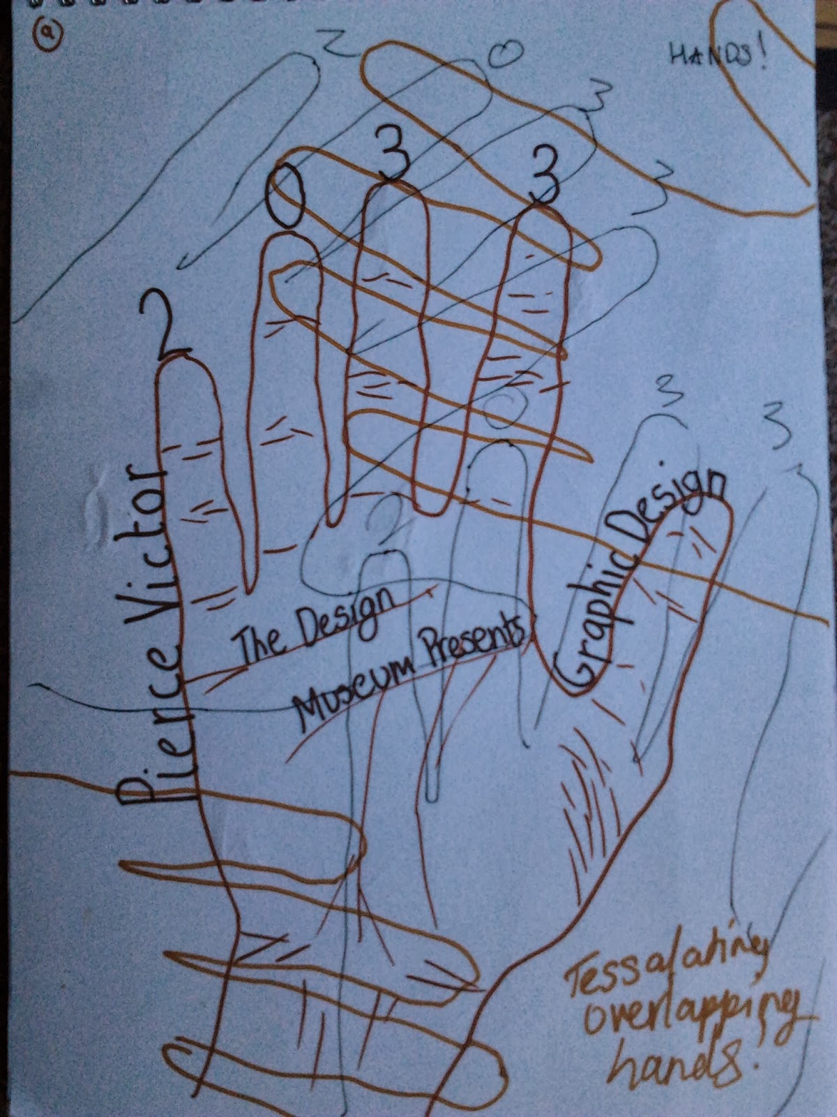 |
| I drew around my hand several times for this design and overlapped them using different colours so some stand out more than others. On the centre hand I included some detail on my hand but the others I left blank. The use of colour is also meant to represent my own skin colour and that of my family. |
Below are some images of my final creation, I choose my first poster design because I believe it was simple and I could complete it successfully in the given time. I used pencil initially to mark out the texts and the imagery. Then afterwards, I went over everything in black pen using a ruler to achieve those straight and sharp edges. I completed the poster with some time to spare but it was a monochrome poster, I decided to add some colour shadowing the main text. At first, I was quite apprehensive because I didn't want to ruin its clean design however I feel the addition of some carefully applied colour greatly enhanced the poster. Overall, I was pleased with my future exhibition poster, I feel it reflects my personality well and most importantly it feel like I am presenting myself, my style and my tastes.
 |
| Final poster without colour |
 |
| Addition of colour to shadow the main text |


Imagery - Author's Own 04/10/13
No comments:
Post a Comment