Thursday, 17 April 2014

DESIGN MUSEUM VISIT


Following the creative making week, we visited the design museum to see Paul Smith's exhibition and the designs of the year exhibition. Having previously known relatively little if not nothing about Paul Smith, I found the trip to be very enlightening and I truely got a sense of what makes Paul Smith such a good designer. Heavily influenced by fashion and graphic prints, I also thought that I wouldn't enjoy his woks as much as I have no real interest in fashion however, I found it did still apply to my own interests. The colour he uses, the processes and his design outcomes as a whole grabbed my attention. I particularly enjoyed his collaborations he did with other brands such as Evian, Rapha and Pinarello putting his own unique mark on existing brands. It shows that you can always recognise a designer by the mark they leave on their work and this was evident in everything Paul Smith had worked on, something which every designer should strive for in my opinion.


The second exhibition we visited was the Designs of the Year. This displayed all the most creative and ingenious designs across several design disciplines including product, fashion, graphic and architectural design. This was another great exhibition for a number of reasons. Firstly, the variety was personally greatly appreciated, sometimes looking at graphics all the time gets a bit boring but there was enough different designs to keep me interested. I particularly enjoyed the 'Whitney' branding as it directly applied to my own final major project and I could appreciate how the design came together and how it works across different platforms. Something else I looked out for was the layout of the exhibits and how they were arranged as I will need to layout my own exhibit space eventually. Obviously I won't necessarily have the same materials to work with however I want to create something that works in a similar way and has the same feel.


Overall, I thought the visit was worthwhile as frankly, the previous times I visited the Design Museum I was slightly disappointed as I didn't enjoy what was on display however this time I enjoyed it. The break from studio monotony is also greatly welcomed as getting out and about can be refreshing, inspiring and motivating for when I finally get back to studio practice.

Images - Author's Own 16/04/14

Sunday, 13 April 2014

CREATIVE MAKING WEEK


Over the course of this week, we had to create and make something out of some everyday random objects like a sock, a sponge and paperclips. The main difference was that the graphics students had to collaborate with the lens based students which previously we had never done. We quickly formed a group of six, three graphics and three lens based students, and brainstormed some ideas. 


At first, working with the lens based students was a bit strange and we didn't immediately click but after we exchanged some ideas, the group quickly got moving in the right direction. Initially we thought about making a physical thing out of the objects, we thought about sock puppets and creating props, however our main collective thought was that we should try creating a little character out of the objects and showing it in some kind of film or animation. The lens based students suggested making a short a stop-motion animation which would be simple but effective, the graphics students agreed and we began to think of storylines and a plot. As this was a lens based task us graphics students suggested creating an illustrated storyboard and a poster to accompany the animation. As both groups of students are in on different days, we allocated roles and divided the tasks, which would enable us to complete the three outcomes by Friday without meeting in between. 

Illustrated storyboard to go with the film. I did the 1, 2, 5, 6, 7 frames using felt tip whilst
a fellow graphics student did the 3rd and 4th. I found this process quite enjoyable and
we were able to complete it successfully in one day. We also only planned to do 7
frames and leave the eighth blank just in case we needed one extra.


A3 Poster made to promote the film

On the Friday we met up and put our outcomes together and presented them to our crit group. We presented our short stop-motion animation, our poster and the storyboard which I feel went well. The animation was received well by the others, they found it humorous and original which was partly because of the way the audio and the visuals were edited. 

Overall, I thought this week might of been waste as I wanted to continue on with my FMP as soon as I got back from Easter, however the break in the routine wasn't bad and working with the lens based students was another way of breaking the monotony. At the end of the week I feel like our group have done very well in producing three solid outcomes using the random objects, everyone made a worthwhile contribution and we made something of the short space of time combining our lens based and graphic design skills

Images - Author's Own 12/04/14

FMP - WEEK 1: GALLERY VISIT

To further support my contextual research, I visited the Tate Modern to have a look and research the use of colour in art and design. I wanted to purely find colourful works then photograph and anylise them. For my FMP I feel that colour will be an important element in the design process and in the final outcomes. I found some great examples in the Tate which didn't really have much design work as such but I could still look for the colour in works and read how or why it was used. The intentions were sometimes clear but in other works I was not sure why certain colour schemes were used. 


Ellsworth Kelly's 'Blue, Black and Red' 
showsthe artist's interest in form, colour, 
shape and sequence. Kelly's works are often
 known for being enitrely composed of just 
primary coloursbut this piece goes beyond
 that range. The colours chosen are likely to
 reflect the artist's direct visual experiences
 be it of the man-made or natural 
environment

Ellsworth Kelly's 'Mediteranee' is similar to 'Blue, Black and Red' in the way that the 
colours are solid blocks however, this piece is a relief as certain segments of the piece 
are elevated across different levels. This literally adds another dimension to Kelly's work. 
I find the colour schemes used are mostly warm with a few cool colous to contrast 
although overall, I believe it works well.


Saloua Raouda Choucair's 'Composition in Blue Module' uses subtle tones of blue 
and purple which delicately shows the shift in colours across the piece. I like the way
 the shapes and colours overlap which in turn creates quite a geometric and graphic image.

Images - Author's Own 03/04/14

Thursday, 3 April 2014

FMP - WEEK 1: RECORD COMPANY CASE STUDIES

Following my visit to the various different record shops around London and the various different logo studies I made, I decided to do three record label case studies looking into the history, culture and creative background of these labels as part of my research. I chose three labels that were similar in musical genre to where I want to take my own label which were: Motown Records (Soul/R&B), BBE Records (Hip-Hop/Dance) and Blue Note Records (Jazz/Soul). I highlighted their history and in particular, the evolution, development and origin of their logo design and branding as this is what I am specifically interested in. I researched the designers that created the face of these labels which includes the logo design, album cover art and some aspects of photography which might of be of interest to investigate more for my own personal use. 


I discovered a lot and feel it was a valuable exercise to inform me of the things I need to consider such as the audience, the vision/motif of the brand and the name of the label throughout my design process.

Images - Author's Own 28/03/14

Sunday, 30 March 2014

FMP - WEEK 1: RECORD SHOP VISITS

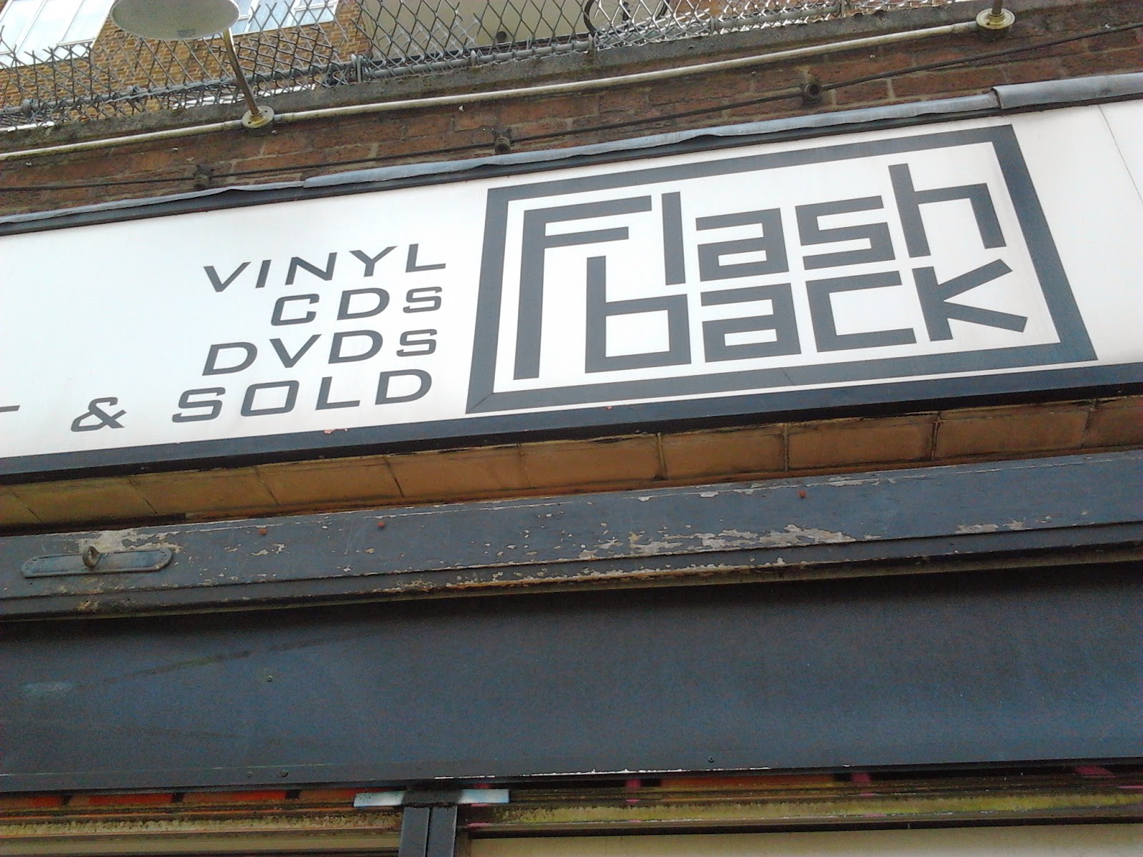
A collection of photos taken from my record shop research visit in and around London. I visited three different stores to give me feel of what makes a record label what it is in relation to the logo, the branding, colours and typefaces used. All the shops had a wide range of album covers from vinyl to CD as well as graphic t-shirt prints and promotional posters, all of which I wish to include in a final outcome in my project. Overall the trip was a very worthwhile source of research as I got to speak to the customers, the people who buy the music and some of the shop workers which gave me a feel of the background, the culture and a contextual base of information to work from throughout my project.


Images - Author's Own 23/04/14

Tuesday, 25 March 2014

FMP - WEEK 1: RESEARCH


For the first week of my fmp I have highlighted my intentions and what I will initially research. I have dedicated the first week or two purely to research and gathering visual imagery and visiting exhibitions, galleries and museums. I firstly began just mind-mapping my thoughts and ideas outlining my lines of research before I began properly. 

As my project is centered around creating a brand identity for a new jazz/hip-hop record label, I visited three record shops in and around London to get a feel for what makes a record label and the culture behind the music. I looked at vinyl and CD cover art, t-shirt designs and other merchandise on display for example promotional posters. I visited Sister Ray, Phonica and Flashback all of which have a extensive collection of music genres which provided me with plenty of visual stimuli. I took photos, made notes and sketches over the visits and in conclusion it was a worthwhile visit. 


As a result of these visits, I started to make several studies of current record company logos using a variety of medias which allowed me to contrast and compare variations in colour, shape, text and layout. I then proceeded to pick three companies and study them in depth looking into their history, their brand identity and what they represent as a record label, all of which are things I need to consider when designing my outcome.


Images - Author's Own 25/03/14